

Jump to the images and close-ups of the designs.
Synopsis:
- There are three proposed designs for the ballpark façade: Two are poor designs (in my opinion), so that leaves a “choice” of just the one — which is not really a choice at all.
- We can do better on these designs.
- The look of the new ballpark will be there for 50 years. To the City Council: Please do not rush this.
- The images on the survey are really too small to be adequately viewed. There’s no date on the survey as to when it needs to be submitted by. The survey is not adequately being promoted.
- Just for fun, here’s the original 1937 invoice for the construction of the ballpark — $11,577 total cost.
Arcata’s Crabs ballpark is being updated. The City of Arcata has a survey so the public can weigh in on which of three façade and entrance designs they like. The three façade designs are from Dillinger Associates, a small firm in Berkeley with four Landscape Architect / Designers in residence. The principal, Reed Dillingham, has 50 Years of professional landscape architect experience.
I find all three of the designs to be boring and dull. The two designs with perforated steel panels are especially inappropriate for us here in Arcata. If we want Arcata to look like “everywhere” those would be good. But we do not want Arcata to be like everywhere else, right ?
The online survey is available at tinyurl.com/arcataballpark or here. The questions that are on the survey are below here.
The problem is: The images in the survey are too small.
The same is true in the press releases in the local media. The survey has a link to “Larger Facade Concept Images” but the images at that link are not larger.
It’s difficult to see what the designs really are. The text in the images can’t be read. And, what’s more, the images contain extra lines, dimensions, and future and past layout designation markers that further clutter what we’re looking at.
Could the designers of these options have given us better, less cluttered images so that it would be easier for us to visualize and choose? Sure, they could have. But they didn’t.
Want to see clean images and close-ups of these ballpark options?
Right here, below, on Arcata1.com.
For close-ups of the three designs, click here.
My opinion on the designs
I find these designs — all three — to be dull and uninspired. The second and third designs, with their perforated steel panels, are especially not in keeping with our downtown. Do we want the ballpark to look like “everywhere” — or do we want it to be part of Arcata?
Eliminating those two selections just leaves the one choice, “Concept A” with the brick column entry. Big yawn.
A look at the projects shown on the Dillingham Associates website (here and here — use the < > arrrows at the upper right corner of the images to scroll) shows utilitarian, dull designs (in my view).
The Dillingham designs get the job done, but don’t give us much more than that. Architecture creates community. These designs make an entry, but don’t offer more. These designs are not an avenue to community engagement. To see what architecture, park design, and street planning can do, see Communities can plan their own futures here on Arcata1.com.
We can do better. How about collaborating with a local architect or architects, and coming up with some concept designs that would be inspiring and uplifting to the community? How about a plaza and entryway to the ballpark with spaces for food carts and children-oriented vendors?
The Funding
In July, 2022, State Senator Mike McGuire announced the State of California would be investing $1 million into Arcata’s ballpark. The funds would be used to construct a new plaza in front of the ballpark, to update disability access, and to build a new façade.
.
The history of the ballpark
The Arcata Ballpark was built in 1938 as a Works Progress Administration (WPA) project. The park has been upgraded over time, but the entrance and barrier behind the grandstand appear to be the original wood.
The Works Progress Administration was a federal program set up during the first term of President Franklin Roosevelt’s administration, during the depths of the Great Depression. As part of the New Deal, the WPA program employed millions of people (mostly men) on public works projects, including public buildings and roads. In California, the WPA was responsible for the construction of Griffith Observatory and thousands of repairs and new additions in the Bay Area. WPA were not limited to construction. The California Folk Music Project [1938-40] was a joint project of the WPA. (Projects in the state and national parks were largely constructed through the Civilian Conservation Corps, a companion program with the WPA.)
The WPA project card in 1937 describes the work, which cost $11,577.65. “Complete construction of municipal athletic field, including draining, grading, constructing grandstand, bleachers, dressing rooms and children’s playground, together with incidental work.”
Here’s the original invoice. From the Living New Deal website.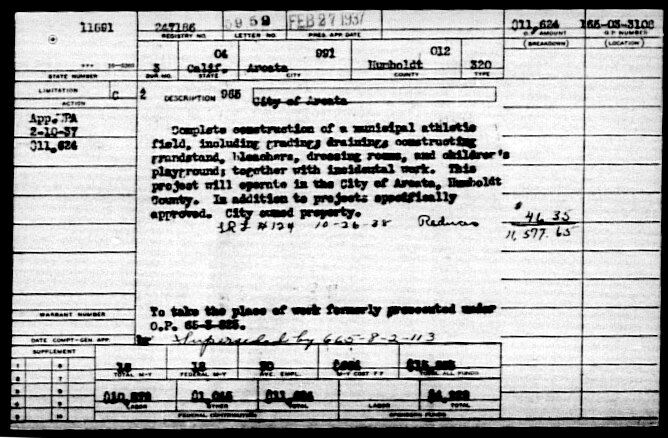
The Designs
For close-ups of the three designs, click here.
To view the images in a PDF viewer, where you can enlarge the image as much as you want, see below here.
On all the images, there are a variety of extraneous lines, texts, and dimensions that, for some people, tend to interfere with seeing and judging what the entrance might look like when built.
On these images, the text is too small to read. For a guide to the what the text says, see below.
Concept A — Classic
“A classic ballpark look with archway and decorative columns and brick motif. Archway shape and vertical composite panels tie in with downtown and other City facilities.”
This is the more traditional design, with a brick column entrance. The vertical composite boards more closely mimic a vertical-board fence.
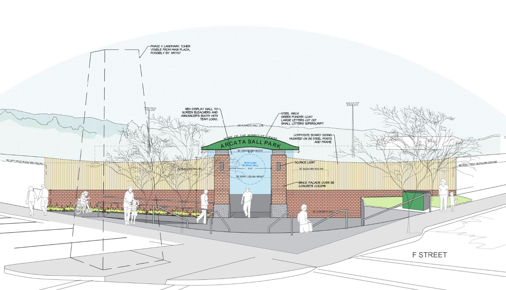
In this view most of the extraneous lines are removed, so we can see the entrance more closely to how it would appear. This includes the dashed lines for the future tower in front, also removed.
Closer views:

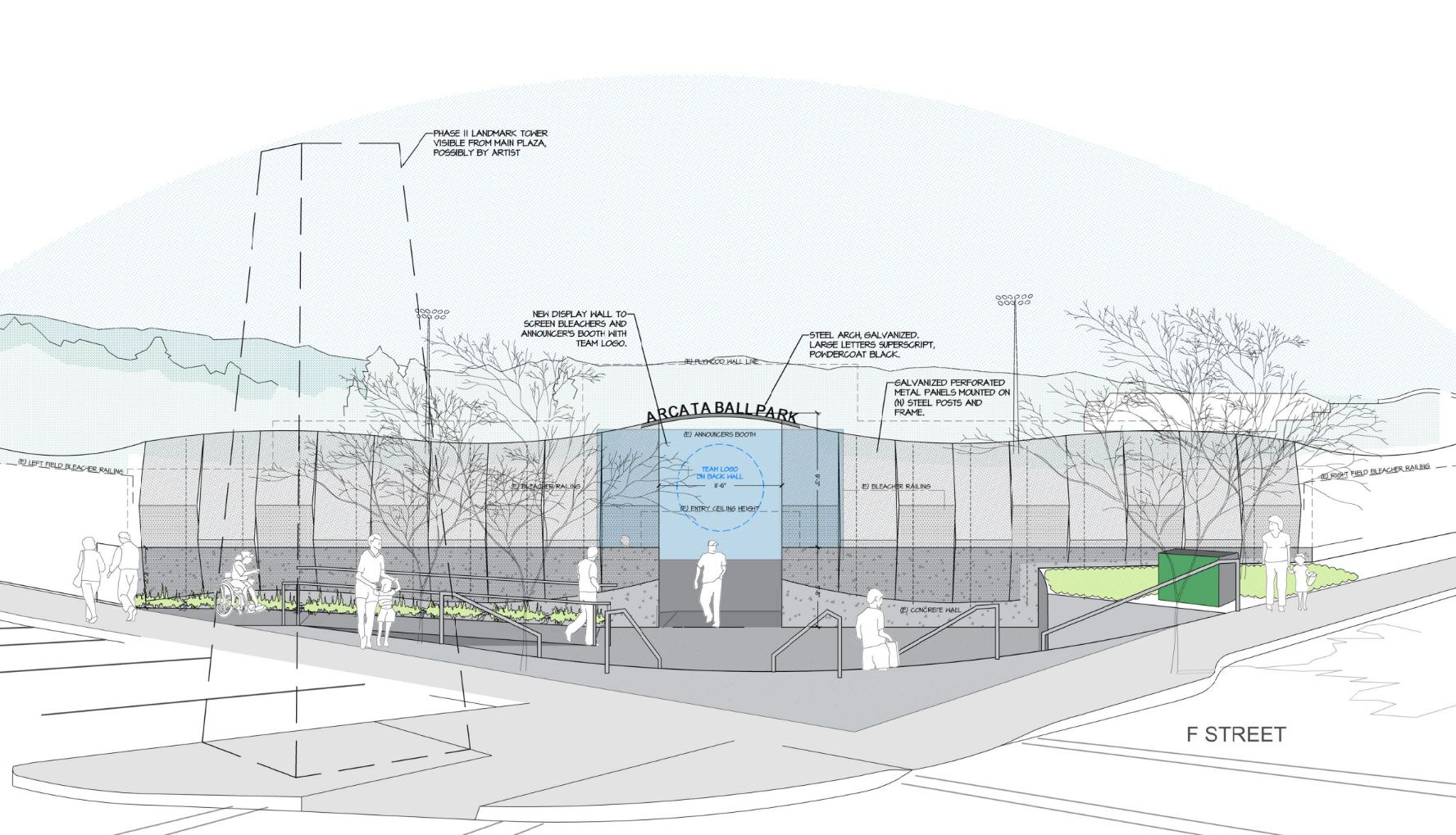
Concept B -1 — A more modern look
“A more modern look with articulated or perforated metal panels with a wavy top edge which could include artistic designs. This concept would have options for type of paneling and massing of the façade which may range in expense.”
This alternative has perforated metal panels as the walls. The brick column entrance is gone. The top of the perforated metal panels is wavy. For a guide to the what the text says, see below.
Closer view:
Concept B -2 — Variation on the more modern look
“A variation on the more modern look with articulated or perforated metal panels which could include artistic designs. This concept would have options for type of paneling and massing of the façade which may range in expense.”
This alternative has an “artistic design” of a ballplayer (left) and redwood trees (right) on the perforated metal panels. The top of the perforated metal panels is straight. For a guide to the what the text says, see below.
Closer view: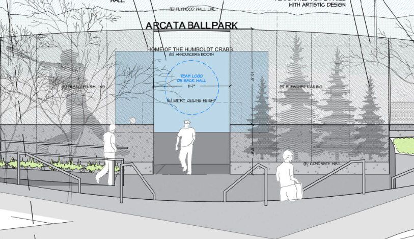
Closeups of the three designs:
Concept A: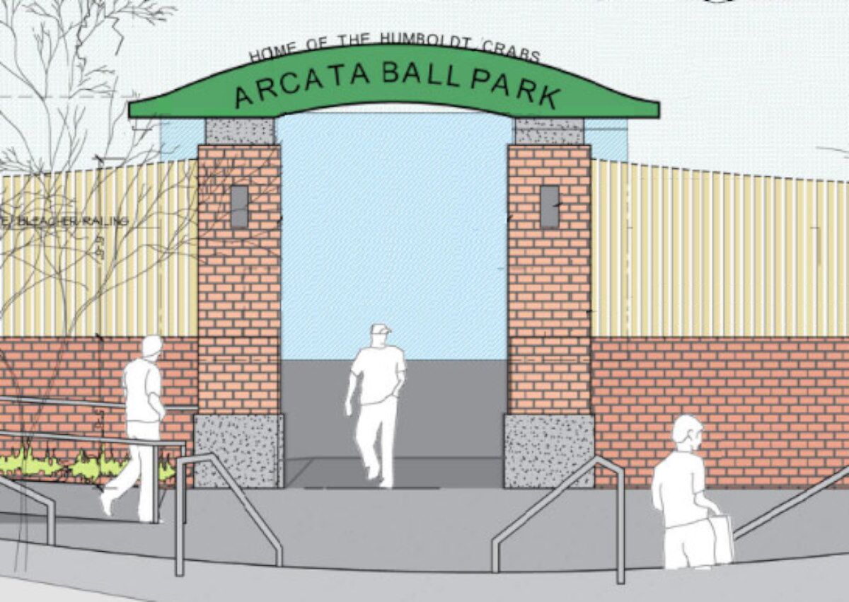 Concept B-1:
Concept B-2: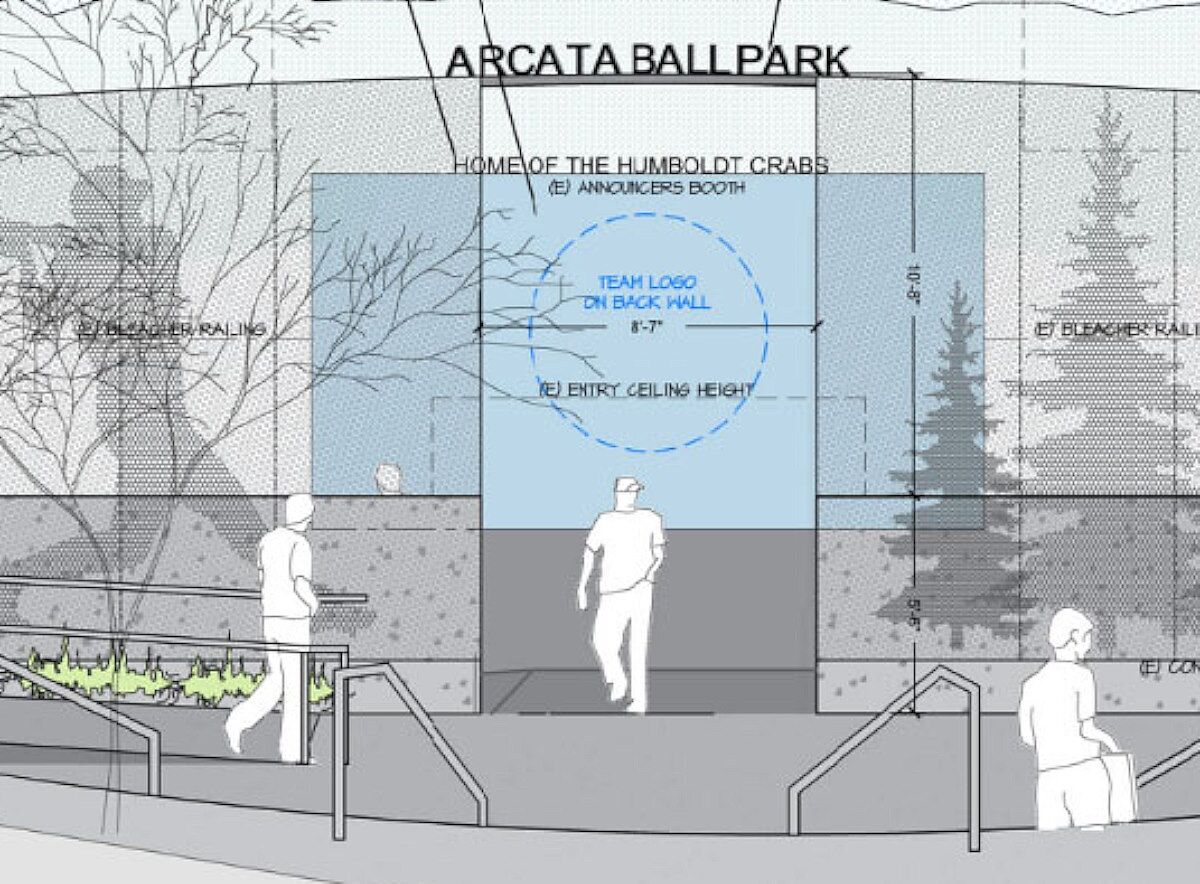
A guide to reading the text
The text in these images is too small to read. Here’s a guide to what it says.
Look up the number in red on the list of what the text says, under the image.

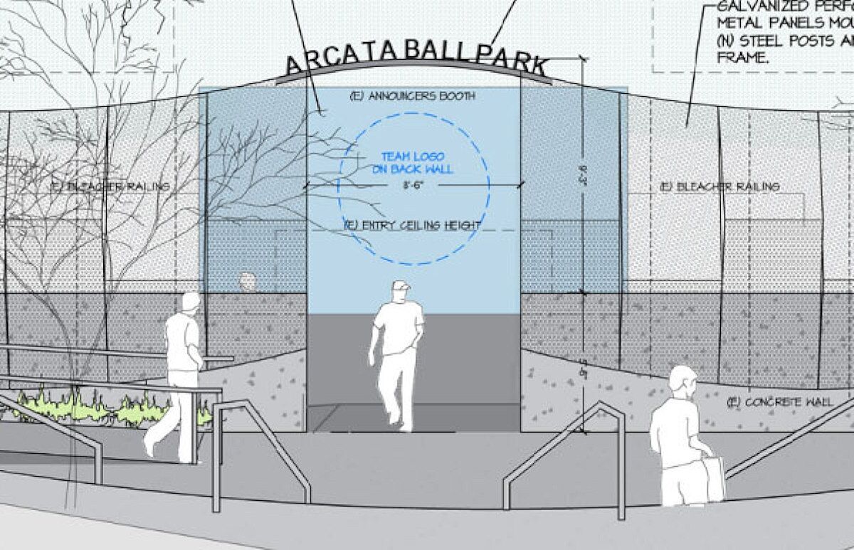
On Concept A:
- Phase II Landmark Tower. Visible from main plaza, possibly by artist.
- New display wall to screen bleachers and announcer’s booth with team logo.
- Steel arch. Green powder coat large letters cut out. Small letters superscript.
- Composite board siding mounted on (n) steel posts and frame.
- Announcer’s Booth. 19′-4″. Team logo on back wall.
- Entry ceiling height.
- Sconce light.
- Bleacher railing.
- Brick facade over (n) concrete column.
- Concrete wall.
- Right field bleacher railing.
- Left field bleacher railing.
On Concept B-1:
3. Steel arch, galvanized, large letters superscript, powdercoat black.
4. Galvanized perforated metal panels on (n) steel posts and frame.
On Concept B-2:
Below 2. Letters superscript, on top of announcers booth wall.
3. Galvanized perforated metal panels on (n) steel posts and frame.
Steel arch, galvanized, large letters superscript, powdercoat black.
4. Perforated metal panel with artistic design.
The Survey
The online survey is available at tinyurl.com/arcataballpark or here.
- What Ball Park Façade Concept do you prefer?
2a. What components do you appreciate about Concept A?
2b. What components do you appreciate about Concept B-1?
2c. What components do you appreciate about Concept B-2?
3a. What aspects may you not prefer about Concept A?
3b. What aspects may you not prefer about Concept B-1?
3c. What aspects may you not prefer about Concept B-2?
4. Do you have any further thoughts to share for the Arcata Ball Park Improvement Project?
PDF viewer of the ballpark images
SHN Arcata Ball Park Engineering Design Services July 7, 2023
This is the contract proposal for $217,900.
It includes (page 8) “Art Scope – Develop Art guidelines and Artist selection process.”