Edited and added to: July 26, 2022
What constitutes good building design?
The adage is “Beauty is in the eye of the beholder” and what might be considered good building design might be similar: People can have different tastes in style and form. Regardless of the aesthetics, the building should be designed to serve the needs of the people who’ll be living there, as well as presenting a welcoming environment to all who walk or travel past.
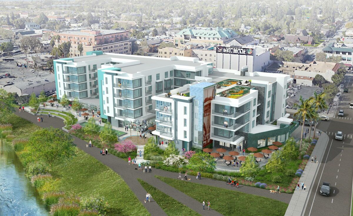
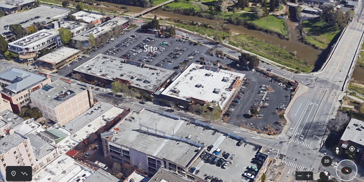
This building, known as “530 Front Street,” was designed for a parcel along the San Lorenzo River in downtown Santa Cruz, at Front Street and Soquel Boulevard. This location currently has a Trader Joe’s store, a CVS pharmacy, a plaza of smaller shops, a pizza restaurant, and more. There is parking for over 250 cars — more than half of the parcel is dedicated to parking.
In terms of urban planning, that spot in Santa Cruz is ripe for re-development. The two large buildings there are single-story which no longer is sufficient for the increasing density of Santa Cruz.
At the rear, it is adjacent to the a public walkway along the river. At the front, it’s on a busy corner location, across the street from a parking garage and the Santa Cruz Museum of Art & History, and just a block away from the very walkable restaurant- and shop-filled Pacific Avenue.
This new building was designed with many pleasant features.
- Both public and private outdoor spaces.
- Useable sized balconies.
- Roof-top garden space. Could be expanded for more garden area.
- Outside activity areas: Bocce, Amphitheatre.
- Outside dining area.
- Parking is on the ground floor, hidden by the surrounding commercial spaces. The parking is “double-decker” with a mechanical stacker car parking system that is two cars in height. For the 170 apartments (185 bedrooms) there are 172 spaces.
- The design minimizes the impact of the height by breaking up the mass so that the full six stories is not apparent from a ground-level vantage point. From the street and from the back, it appears as 5-stories. In addition, the building uses as patented method of construction for less space between the floors. A 6-story building using this method is about the height of a regular 5-story building.
- The 6th floor is 60% of the size of the floor below, per the code in effect at the time.
Some less-than-good aspects:
- The building, as it is designed, is a total of 170 units. The studios and micro-studios apartments (100 units) have an average sizes of 375 sq.ft and 475 sq.ft. — they make up 44% of the floor area. There are 55 one-bedroom units, in 582 sq.ft. and 689 sq.ft. sizes, also about 41% of the total floor area. The 15 two-bedroom units are 915 sq.ft. and amount to about 15% of the total floor area. In Arcata, we might want fewer studios and a greater number of larger units.
- The design has only 48 bike parking spots, plus 137 storage units of different sizes where a resident could conceivably store a bike. I’d like to see more actual bike parking spots.
- Only 22 electric vehicle charging stations for 185 parking spaces. That can be improved.
- The super-graphic on the side of the building (see below) is just silly. The color scheme wouldn’t translate well to Arcata either, but those things are easy to change.
The developer has pulled these plans and supplemented them with a newer design — 276 units on 8 stories, with 169 studios and micro-studios, 102 one-bedroom units and only 5 two-bedroom units. New Santa Cruz regulations require 1 bicycle parking stall for each unit, so the new design includes 276 bike parking stalls. Arcata could require an even greater figure, perhapss one space per studio and 1.5 spaces for each one-bedroom unit.
Those building on the other side of Front Street in which people had enjoyed the views of the hills and the rays of the morning sun will unfortunately have both enjoyments taken away.
I do not regard this design as perfect by any means. But in terms of whether a 6-story building could “fit in” to Arcata, it’s a good place to start. Clearly any building is designed for a specific location — it would not be adjacent to a river here in Arcata — so I’m not suggesting that this building could be sited here as-is without transformation.
This looks huge! How large is it really?
In Santa Cruz, the building’s lot is about 327 feet long and an average of about 142 feet deep. In Arcata, our block size (without the street width) is 250 feet, or 300 feet wide from the center of one street to the center of the next street. So this building is roughly the size of one block — on a parcel without a through street. There are parcels in Arcata on which this would fit, pretty much as it. More likely it would be reconfigured to have a little more depth and less length.
The ground floor is about 38,000 square feet, and the 2nd through 5th floors are around 29,000 square feet. The 6th floor is 60% the size of the the 5th floor, ~16,600 sq.ft. The entire site is about 46,000 sq.ft., or 1.06 acres.
By comparison, Sorrel Place has a footprint of 14,000 sq.ft., But the parking and driveway area is external to the footprint at Sorrel Place, so there is 12,000 sq.ft. of asphalt paving, with parking for 15 cars for the 44 units. There’s also what is written as 1,500 sq.ft. for the Tot Lot, though it looks to be around 350 sq.ft. At Sorrel Place, the total site area is ~30,000 sq.ft., or 0.69 acres.
The Santa Cruz building design has the parking within the building, on the ground floor. There is 7,000 sq.ft. of commercial space in this design (there could be more) and 30,000 sq.ft. of parking for 185 cars. There is 21,000 sq.ft. of private open space, in the form of balconies, private courtyards, and rooftop gardens.
There are 50 balconies for the 170 units, with sizes ranging from a minimum of 52 sq.ft. (equivalent to a 5×10 space) to 125-150 sq.ft. (equivalent to a 10×15 space) and for one apartment 276 sq.ft. By contrast, the design of Sorrel Place has one-bedroom units with what look to be 40 sq.ft balconies, and three-bedroom units with what look to be 60 sq.ft. balconies. (~6×10). Just because it is low- and very-low-income housing does not mean that people should be deprived of open space.
So it is about 50% larger area than Sorrel Place in total in terms of its ground-floor footprint. Within that 50% increase in ground-floor area are parking for 185 cars vs. 15 for Sorrel Place, 7,000 sq.ft. of commercial space vs. zero for Sorrel Place, and close to 14,000 sq.ft. of places to sit and meet people vs. two park benches in a ~15×20 space facing the street with Sorrel Place. So, yes, it is bigger, and also much much better designed.
A city block in Arcata is about 1.4 acres — so this building would, in theory fit on a city block here in Arcata. It looks large in part because the rendering drawings are intended have the building look imposing and grand.
Could this be built here?
In terms of “Could this be built here?” there is one strong consideration to keep in mind. When looking at the images of this building and evaluating the construction, the brick and tile and other finishes, the quality of the exterior and interior… think about the possible per square foot construction costs of a building of this quality, relative to, say, the new Danco-built Sorrel Place building on 7th Street between I and J. And then recognize that the average rental price of a 400 square foot studio apartment in Santa Cruz is now $2,700 a month (June 2022). In another project by this developer, the 500 sq.ft. one-bedroom units rent for $3,800 a month. In Arcata, tenants could not accept a rental cost that high. The rental cost is to a great extent tied to the cost of construction. Getting rid of some of neat features, such as the double-decker Stacker garage system, will lower costs. In terms of rents, though, a building like this would be unlikely to be built in Arcata. But there are other factors at play, and things may change.
It is of course patently unfair to compare a higher-end apartment building with the low-income housing provided by Sorrel Place. What we’re looking at here is the design. The Santa Cruz Front Street building is a far better design for people — for both the people who live there and for the people of the town who come there to eat, shop, meet friends, and stroll.
Images of the building
Here is the view from the street. Five-stories, with shops and such on the street-level floor. Note that the balconies are not just the minimal-four-foot depth, but actually have a useable space as a balcony. Retail shops on the ground floor facing the street. Architect’s computer-created renderings are typically clean and perfect and do not portray reality, of course. Still this is pretty much what the building would look like.

Please imagine this without the silly late-1960s VW Bus super-graphic on the building. This is the view from the rear, walking along the pathway that is adjacent to the San Lorenzo River. That pathway and the accompanying green open space is not a part of the apartment’s lot — the building’s lot starts with the low shrubbery just beyond the two people on the red bikes at the center-right of the image, or at the steps seen toward the left side. 

Some images of the details of the property. For a closer view of these images, view the architectural drawing details, below, and enlarge the PDF files to see each image.
Architectural drawing details
Here we can see the stacked car parking. The lower car is in a pit 7′-6″ below ground level.

Here we can see the Roof Gardens.

Some PDF images of the developer’s drawings are below. If you would like to look at more detail, you can enlarge an area with the “+” key.
Aerial Images of the siting in Santa Cruz
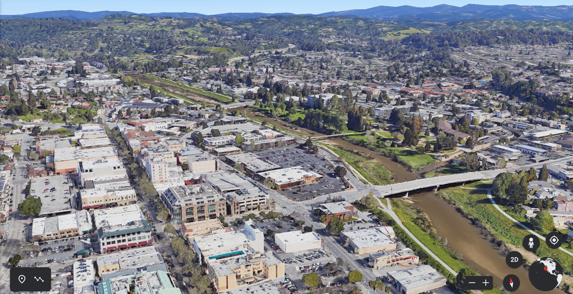
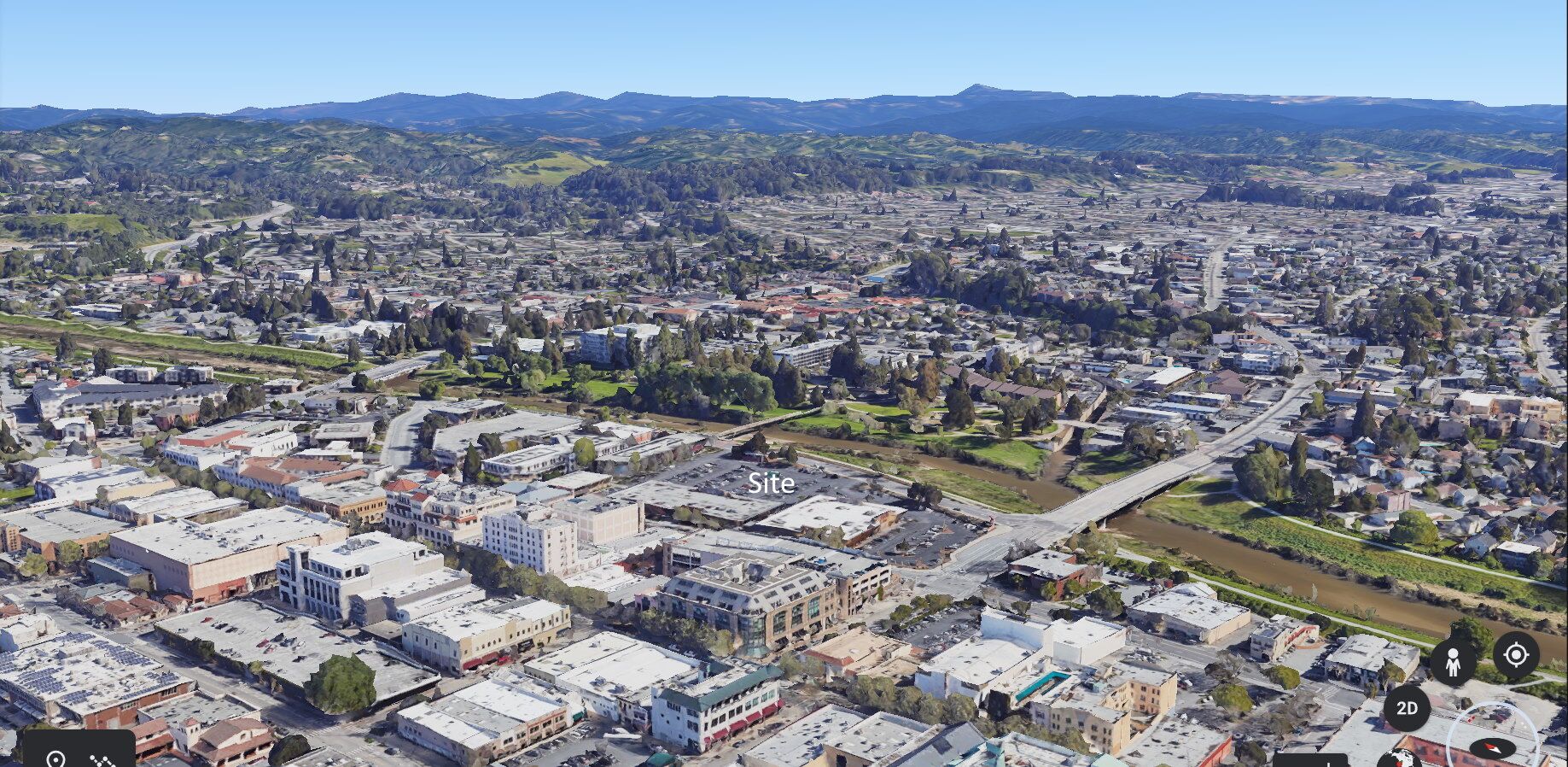
Here are some aerial images, so you can see how the new building would fit into the Santa Cruz setting. Currently the site has the Trader Joes, the CVS Pharmacy, and the larger parking lot.


Some inquiries I received led me to add the following information:
Some rental units have prices that are “stratospheric” relative to what we have here. Such as: $3,800 for a 1 bedroom 500 sq.ft. apartment.

